How to Make a Legend for a Bivariate Choropleth Map in ArcGIS Pro
By Amy Sue Heath, April 7, 2020
 |
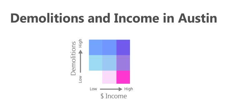
| Exploring the relationships between demolitions and income in Austin. |
First, start out with two layers. Each of my layers had a numeric field in their respective attribute tables that I wanted to compare. When you make your map, one set of data should be on top of the other. This would require the top layer to have a transparency used in order to see the one beneath it. Be sure to choose layer symbol colors that look pleasing when mixed. Remember your color theory, when any two complimentary colors are mixed (ex. Red and green or blue and orange) they will create a neutral brown so maybe stay away from complementary color themes. Using colors that are only a few spaces away from each other on a color wheel is usually a good place to start.
On a layout, insert a legend containing the two layers. Right-click the legend to convert it to graphics. Right-click again on the graphic legend to ungroup the elements in legend. Ungroup yet again in order to convert all elements into individual graphics. We will only be using the blocks symbolizing the amounts for your two layers. Select all of the color blocks you will be using and drag them off to the side where you have enough room to manipulate them without touching other elements.
Right-click the selected blocks to and select Properties to change their shape. I changed the width of the patches to .9 inches and the height to .3 inches.
Select each graphic and arrange them so that they are no longer overlapping.
Now select the colors for only one layer. Group them together and rotate them 90 degrees.
Group the other set together and rotate it 180 degrees.
Then drag it on top of the other square and presto you have a color matrix for your multivariate map.
Lastly, rearrange to your liking, add some labels, and you’re done!


No comments:
Post a Comment